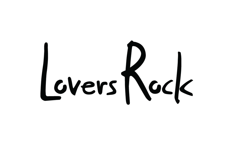
This is the LR logo as is from the font we chosen:
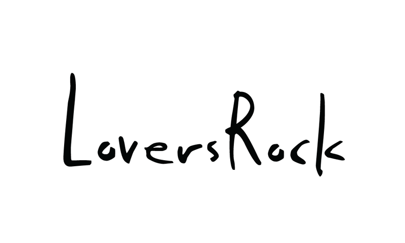
I then worked on smoothing and reshaping the letters for two main reasons:
1: detach from the simple font usage
2: give it a better look (in terms of letter spacing etc…)
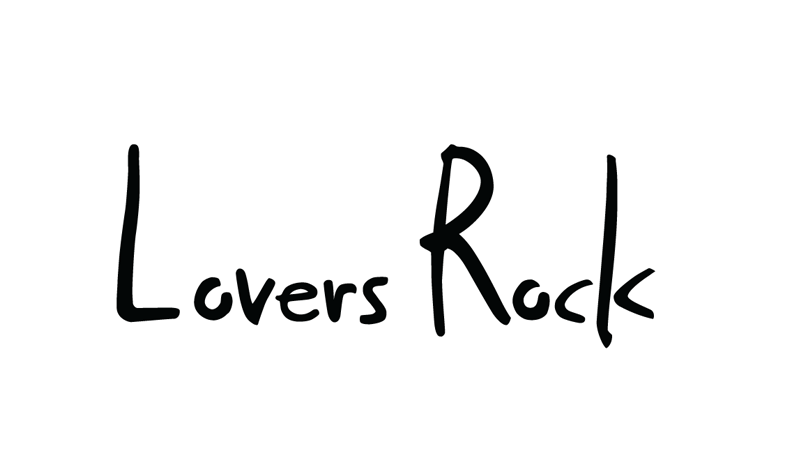 I shifted the L and the R to give the whole logo a more compact look
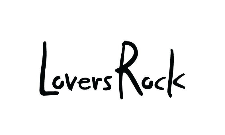
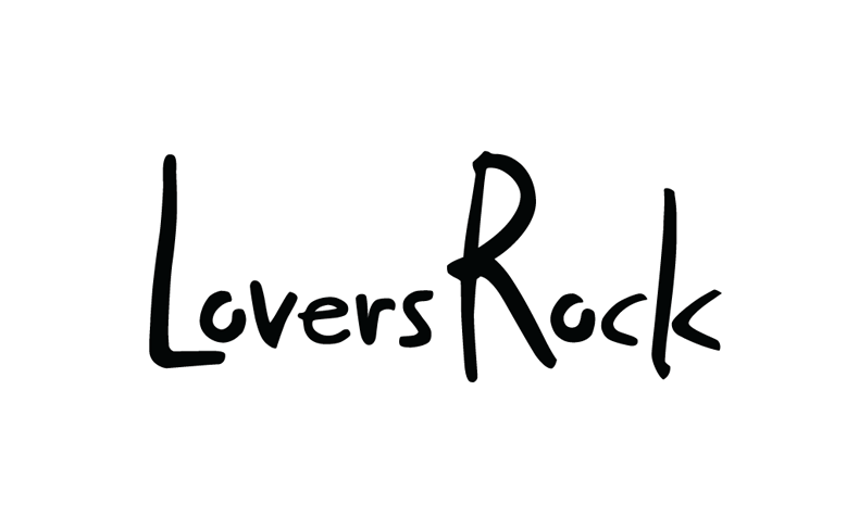
Fixed some other letter spacing problems and the “k” looks, and here we go with the final design